
Designers are turning to everyday objects like fruit boxes and street-food packaging to find a visual language that resonates with local patrons facing constant urban flux. As the skyline of São Paulo transforms under the weight of an aggressive real estate boom, the city’s architectural heritage is frequently being traded for high-rise glass structures and sterile commercial developments. This rapid turnover has created a sense of geographic displacement among residents who see their favorite landmarks disappearing almost overnight. In response to this erasure, a significant shift is occurring within the hospitality sector, where new bars and restaurants are consciously avoiding the cold, clinical minimalism that defined the previous decade. Instead of following globalized aesthetic trends that prioritize sleek surfaces and neutral palettes, creative studios are leaning into a concept known as “manufactured heritage.” By deliberately crafting visual identities that feel decades old, these establishments are attempting to provide a much-needed emotional anchor for a population navigating a city that often feels like it is in a state of permanent demolition.
The Evolution of Visual Identity
From Global Minimalism to Local Vernacular
The visual landscape of São Paulo’s upscale dining and drinking scene was once dominated by a very specific type of “elegant” toolbox. This style relied heavily on clean, geometric sans-serif fonts, abstract patterns such as perfectly aligned dots or hatching, and a general adherence to the “less is more” philosophy. However, by the start of 2026, this approach has largely been viewed as generic and disconnected from the vibrant, chaotic reality of Brazilian street life. Designers are now actively rejecting these globalized templates in favor of what is known as “vernacular” design—the unpolished, everyday visual culture of the local neighborhood. This involves taking inspiration from low-brow sources like the typography on fruit crates at the local market, the weathered signage of family-run bakeries, and the rudimentary packaging of street snacks. This revival is not just an aesthetic choice; it is a calculated move to ensure that new businesses do not feel like interchangeable retail units but rather like authentic cultural landmarks that have existed for generations.
This transition reflects a broader societal push for warmth and familiarity in a world that feels increasingly digital and detached. By embracing “playful imperfection,” designers are creating identities that feel handcrafted and human, moving away from the clinical precision of computer-generated graphics. This shift often involves the use of custom-made typefaces that mimic the quirks of hand-lettering and the inclusion of illustrative elements that celebrate local fauna, historical figures, or neighborhood lore. The result is a brand identity that invites patrons to relax and connect, fostering a sense of belonging that geometric minimalism simply cannot provide. As these new establishments open their doors across the city, they are effectively using graphic design to build a bridge between the historical memory of the neighborhood and the modern needs of its residents, ensuring that even the newest bar on the block feels like it has a soul.
The Research-Led Strategy for Authenticity
To achieve a sense of “manufactured heritage” that feels genuine rather than superficial, design studios are adopting rigorous, research-led methodologies. This process goes far beyond glancing at a Pinterest board for retro inspiration; it involves diving deep into local archives, studying early 20th-century lithography, and analyzing the bold, experimental advertising styles of the 1970s. By understanding the historical visual grammar of São Paulo, designers can create “narrative branding” that tells a story through every menu, matchbox, and coasters. This depth of research is what separates a truly immersive environment from one that merely looks “old-school.” Successful projects are those that can identify a specific era or cultural movement—such as the vibrant commercial graphics of the industrial expansion period—and translate those elements into a contemporary context that resonates with the modern consumer’s desire for storytelling and depth.
Furthermore, this move toward narrative-driven design allows brands to build expansive visual worlds that go beyond a simple logo. A single establishment might use three or four different typographic styles, various illustration sets, and even specific analogue photography techniques to create a multi-layered identity. For instance, the use of analogue flash photography can imply a sense of spontaneity and history, suggesting that the bar has been the site of countless celebrations over the years, even if it opened just last month. This approach treats the brand as a living entity with its own history and personality, rather than just a commercial business. By providing this rich visual context, designers are helping hospitality owners compete in a crowded market where “vibe” and “authenticity” are the primary currencies. The goal is to create a space where the branding acts as a protective layer against the impersonal nature of urban development, giving patrons a reason to return that is based on emotional connection.
Case Studies in Manufactured Heritage
Reimagining the Neighborhood Boteco
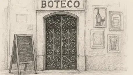
The traditional Brazilian boteco—the unpretentious neighborhood bar—has long served as a cultural anchor in São Paulo, but many of these original spaces are being lost to high-rent redevelopment. In response, a new generation of bars is using graphic design to emulate the specific, welcoming atmosphere of the classic boteco while offering a modern service experience. A prime example of this is the use of a “typographic medley,” where multiple variations of a brand’s name are used interchangeably across different touchpoints. This mimics the organic, unplanned look of older establishments that would have acquired signage and printed materials from various sources over several decades. By intentionally incorporating elements like line gradients, drop shadows, and frames inspired by vintage matchboxes or cachaça labels, designers can recreate the “hipsterism by the book” that feels both nostalgic and fresh, providing a comforting familiar environment for local residents.
This simulation of heritage is particularly effective when it leans into the “everyday” aesthetics of Brazilian life. Projects like Bar Ovo have successfully utilized these techniques to create a space that feels like it has always been part of the neighborhood fabric. The identity does not rely on a single, static logo but rather a collection of playful marks that appear on everything from the storefront to the napkins. This profusion of visual elements creates a sense of history that acts as a buffer against the sterile glass and steel of the modern city. It is a strategic use of nostalgia that prioritizes the spirit of the venue over the rigid rules of corporate branding. By focusing on the “spirit” of the neighborhood hangout, designers are able to manufacture a sense of permanence and community in a city that is constantly changing, proving that a bar’s visual identity can be just as important as its physical architecture in preserving a sense of place.
The Rural Imaginary and Intentional Imperfection
Another fascinating direction in this retro-branding movement is the exploration of the “Brazilian rural imaginary,” an aesthetic that has historically been overlooked in major urban centers like São Paulo. Studios like Estúdio Arado are leading this charge by incorporating elements of rural folk art and early commercial graphics into urban projects like the Duas Irmãs Brewery. This style often features hand-painted storefronts, stylized portraits of the owners in traditional oval frames, and illustrations that bridge the gap between early 20th-century lithography and modern comic book stylization. By rejecting digital perfection in favor of “intentional imperfection”—such as simulated color misregistration or the heavy, irregular outlines of Xerox-style printing—designers are creating a tactile, human counterpoint to the sleekness of modern metropolitan life. These textures evoke a sense of naivety and DIY spirit that many patrons find more trustworthy and engaging than polished corporate visuals.
The use of specific printing techniques, such as Risograph or screen printing, further enhances this sense of authenticity. These methods produce subtle variations and textures that are impossible to replicate with standard digital printing, giving every piece of collateral a unique, one-of-a-kind feel. For example, the “melted” visual style of the bar Suei, designed by Flora Carvalho, utilizes these irregular outlines and patchy blacks to evoke the feeling of 1970s zine culture and vintage street posters. This approach values playfulness and experimentation over brand recognition, often using multiple, vastly different wordmarks to maintain a sense of spontaneity. By embracing these analogue-inspired textures and rural motifs, designers are not just looking backward for the sake of it; they are finding new ways to inject personality and life into the urban environment. This celebration of the “imperfect” serves as a powerful reminder of the human hand behind the brand, fostering a deeper connection between the establishment and the people who frequent it.
The Role of Design in Urban Preservation
Creating Identity in a Changing Landscape
In a metropolitan environment like São Paulo, where the legal protection of historical buildings is often slow or non-existent, graphic design has evolved into a sophisticated form of “symbolic reconstruction.” When a developer demolishes a mid-century building to make room for a luxury condo, the neighborhood loses more than just brick and mortar; it loses a piece of its collective memory. Designers are stepping into this void by using retro branding to restore a sense of continuity and “affective life” to these changing areas. A bar that opens on the ground floor of a new development can use its visual identity to pay homage to the history that was lost, acting as a surrogate for the neighborhood’s soul. This process involves more than just a retro font choice; it is about creating a “distinctive character” that helps residents feel connected to their surroundings, even as those surroundings undergo radical transformation.
This trend is not merely an exercise in irony or a superficial “hipster” aesthetic, although those elements certainly exist. At its core, it is a functional tool used to solve the problem of urban alienation. By using the lowercase wordmarks of a 1968 literary edition or the river guardian icons of Bahia, as seen in the work for Salva Bar, designers are tapping into a rich, syncretic history that provides a sense of grounding. This “functional nostalgia” allows a business that has only been open for a few months to command the same respect and loyalty as a neighborhood institution that has been around for decades. It provides a narrative framework that makes the newness of the establishment feel less like an intrusion and more like a natural evolution of the city’s story. In a city that is so quick to erase its past, graphic design has become a vital tool for ensuring that the future of São Paulo still looks and feels like home.
Implementing Authenticity in the Modern Metropolis
The exploration of São Paulo’s hospitality scene through the lens of retro branding demonstrated that the most effective visual identities were those rooted in deep cultural immersion rather than superficial imitation. Designers identified that the shift away from minimalism required a fundamental reimagining of what a “brand” could be, moving from a static logo to a dynamic, narrative-driven ecosystem. The next steps for the industry involved a broader integration of these vernacular aesthetics into larger-scale developments, suggesting that even corporate-led projects benefited from the warmth and character of handcrafted design. This approach encouraged a more nuanced conversation about urban preservation, highlighting that the “soul” of a neighborhood could be maintained through thoughtful visual storytelling even when the physical structures were lost.
To move forward sustainably, practitioners and business owners focused on developing original typefaces and illustration styles that reflected local histories, rather than relying on global trends or digital filters. This proactive strategy ensured that the “retro wave” remained a powerful tool for community building rather than becoming a formulaic aesthetic. By prioritizing the “analog” in an increasingly digital world, the design community successfully fostered spaces that felt lived-in, welcoming, and authentically connected to the complex identity of the city. The lessons learned from this movement provided a blueprint for other rapidly developing metropolises, showing that a commitment to historical research and playful experimentation could effectively counteract the sterility of modern urban expansion. Ultimately, the success of these projects proved that while a building could be demolished, the memory and character of a space could be preserved and even revitalized through the power of strategic visual innovation.